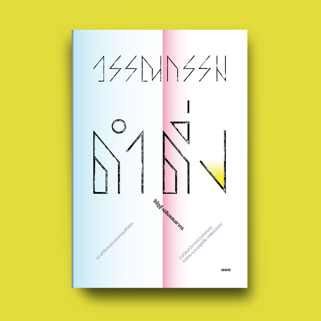
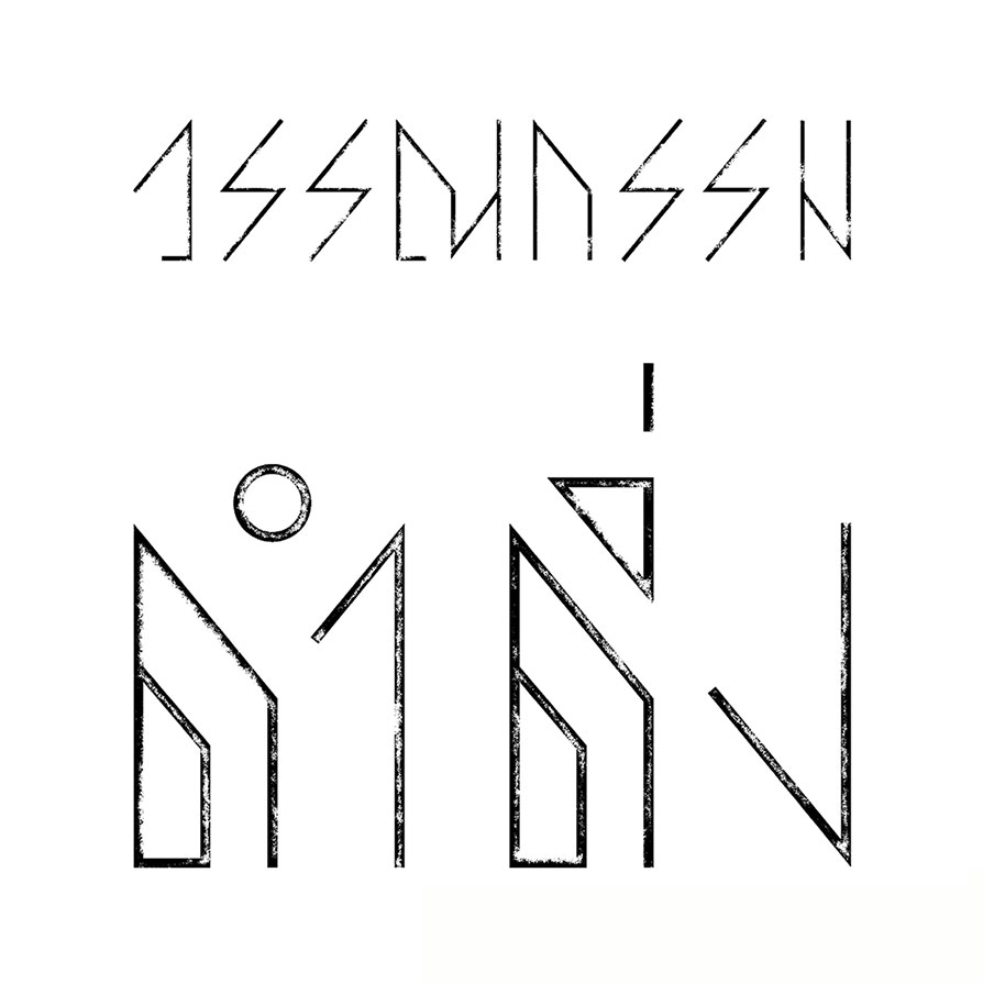
I was commissioned by Gloomphim House, a Thai indie press, to design the cover for their book, วรรณกรรมดำดิ่ง (literally “literature takes a dive” or “literary dives”). The main request was to have a unique typeface for the title. I came up with this design, an effort to create a downward motion with a kind of “weathered surface” feel in the typeface.
The book is a collection of essays on various literary works, written by the award-winning critic Jirat Chalermsanyakon (จิรัฏฐ์ เฉลิมแสนยากร), who is also a talented fiction writer in his own right.
This is the cover design for the book:

Leave a comment